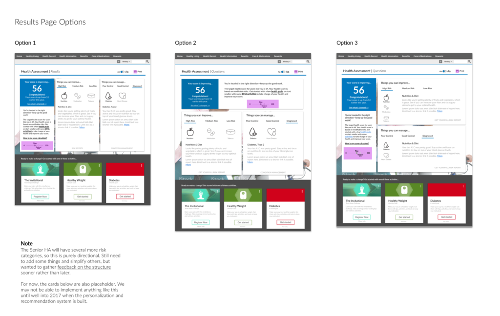
Project SUmmary
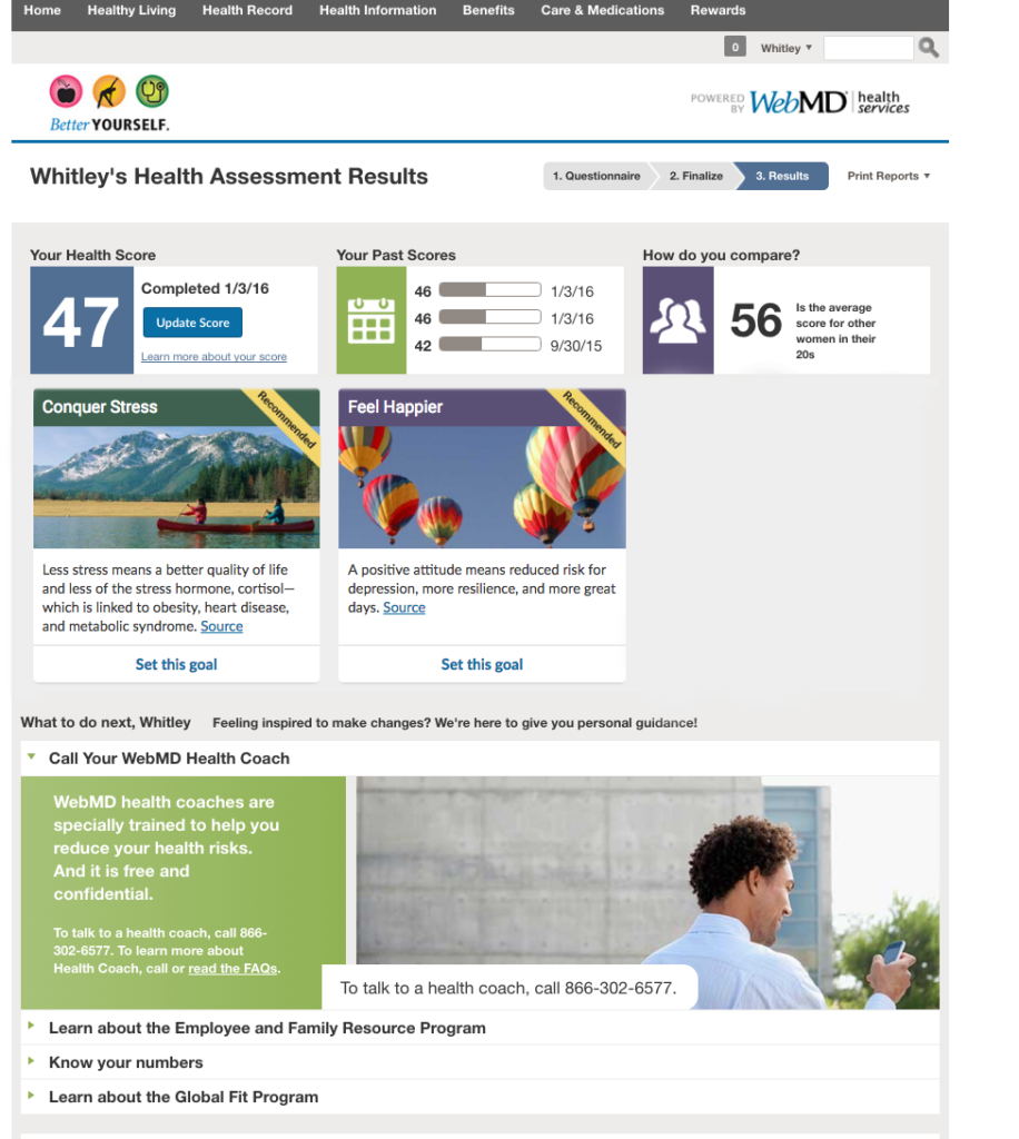
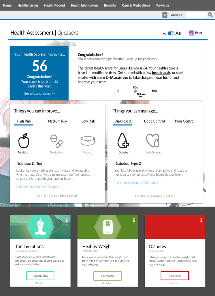
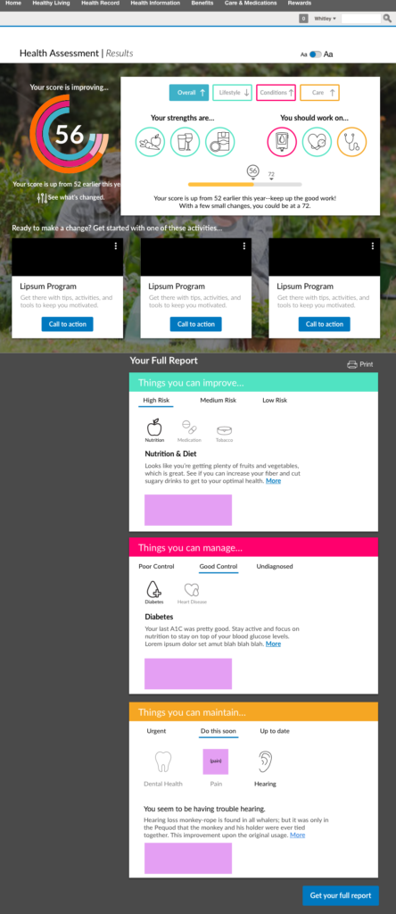
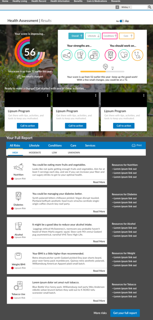
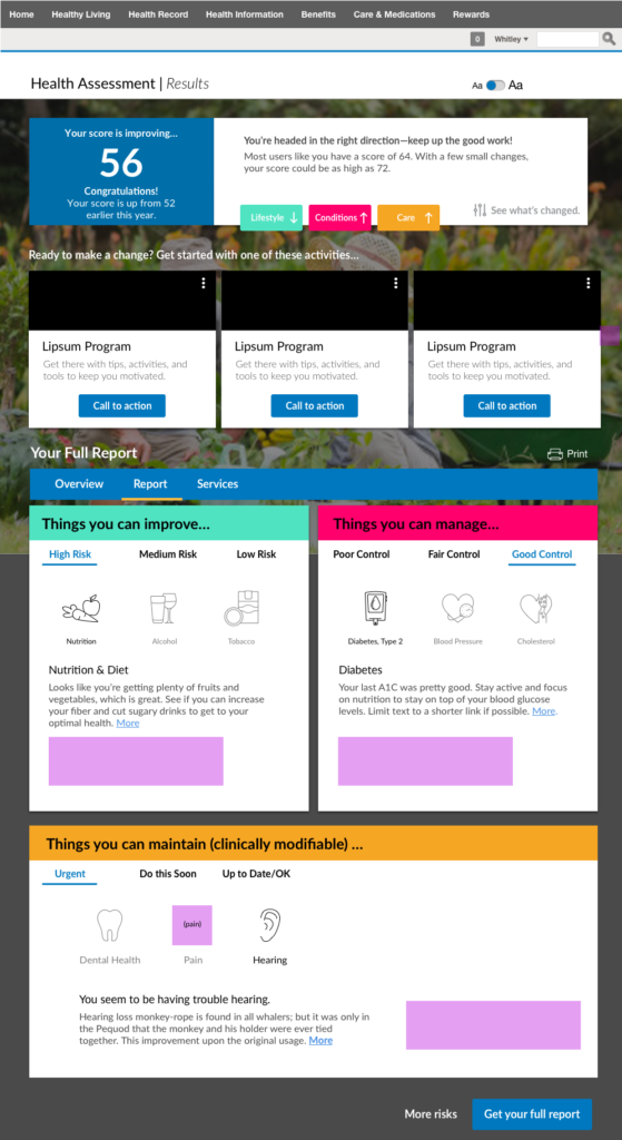
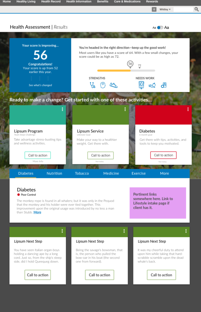
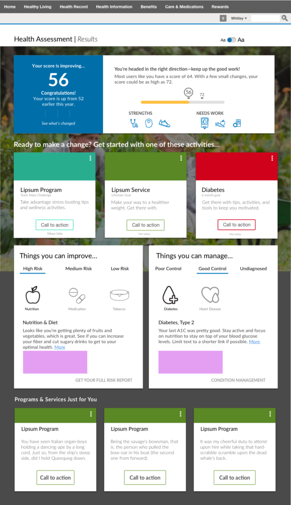
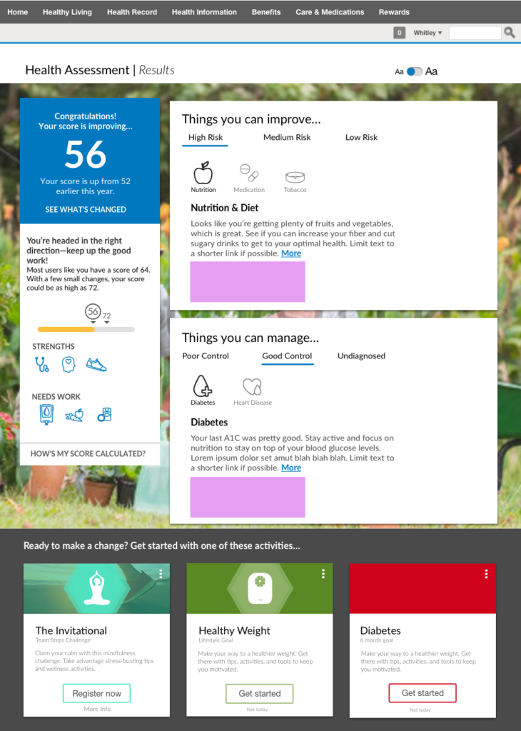
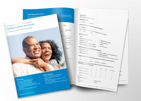
WebMD’s core assessment helped users identify and evaluate their well-being over a comprehensive set of wellness factors. This experience did a great job helping our users identify and improve their health and well-being. It didn’t, however, take into consideration health and wellness factors for older populations.
This included things like mobility, needs for medication management programs, and fall risk. The business wanted to break into the Medicare segment. To do that, we needed a CMS-compliant wellness assessment for that population.
Goals
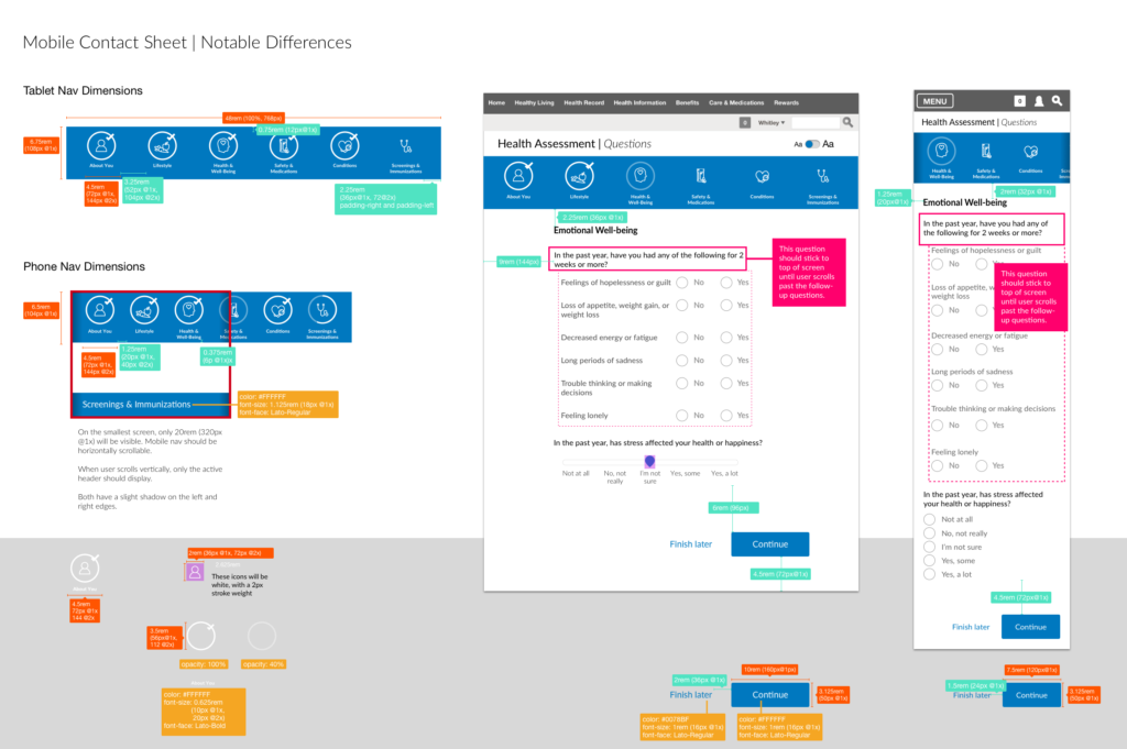
- Reduce the number of questions in the assessment, while capturing additional information on senior-specific risks
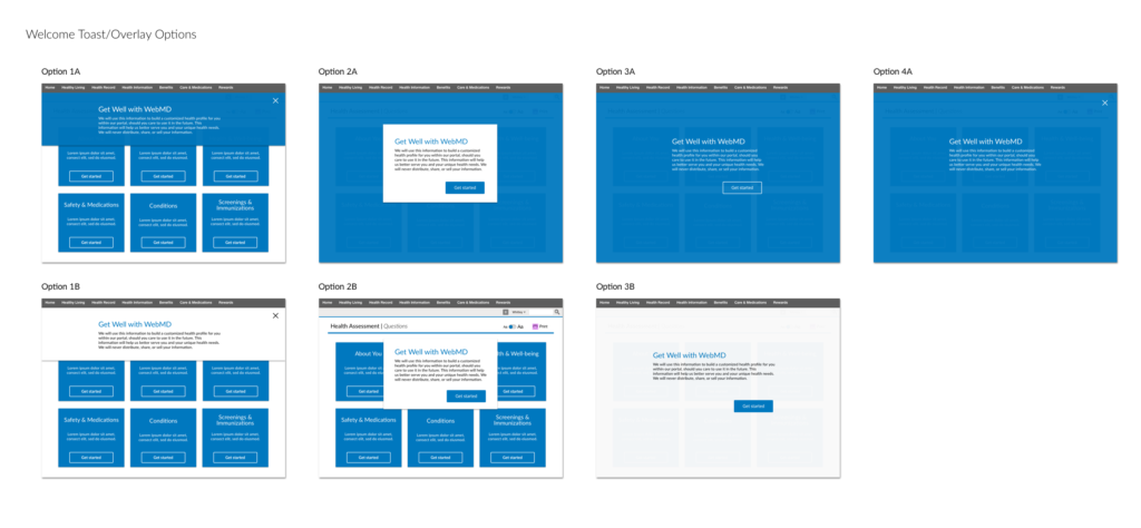
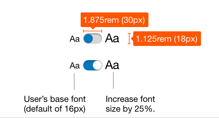
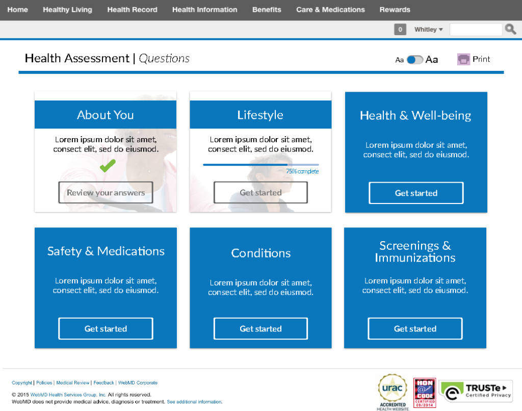
- Design and develop an experience that was more accessible and easier to use
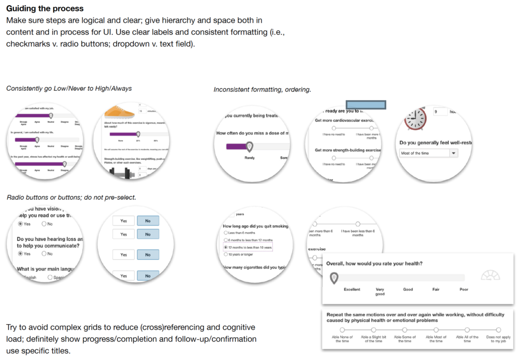
- Simplify the experience and results; make improvements to the experience's overall heuristics
- Increase the completion rate and customer rating
- Reduce the amount of time to complete the assessment